Redoing back bath - in progress

I have been doing tons of research on the house and it is very clear that the 2 bed 1 bath addition at the very back of the house has nothing to do with the historic details of the house that we are trying to preserve. For that reason, it will be remodeled in a neutral style in mostly white since it isn't really possible to try and make it match the awesome design and woodwork of the rest of the house.

In general, when doing whole house remodels, it's a good idea to repeat design themes throughout. In this case, some elements from work I've done to the house will be repeated - mainly the 6x6 white tiles in running bond pattern and white track lighting that doesn't make a statement but simply illuminates. I used the white tiles in the kitchen above the red 6x6 pattern so that I could add a vent fan in the kitchen which was much needed. I also added white 6x6 tiles above the old clay tiles in the bathroom to raise the shower head. These white tile surfaces provide a functional surface while blending into the wall and not distracting from the old tile work which is probably from the '20s on the bath floor and the '30s on the wall in the bath and kitchen.

The back bath shower was originally 1/8" Masonite which is pretty odd since it is not an effective moisture barrier. If you know the stuff, it seems about as strong as really good cardboard.

The obvious choice was to do the shower in white 6x6 to continue the theme to unify the design throughout as much as reasonably possible.


The white track light I added has LED bulbs and was also used in the kitchen. It's a flexible system that simply adds light where it's needed. 

The downstairs bath also has unobtrusive white LED lighting in the form of recessed 4" cans. 


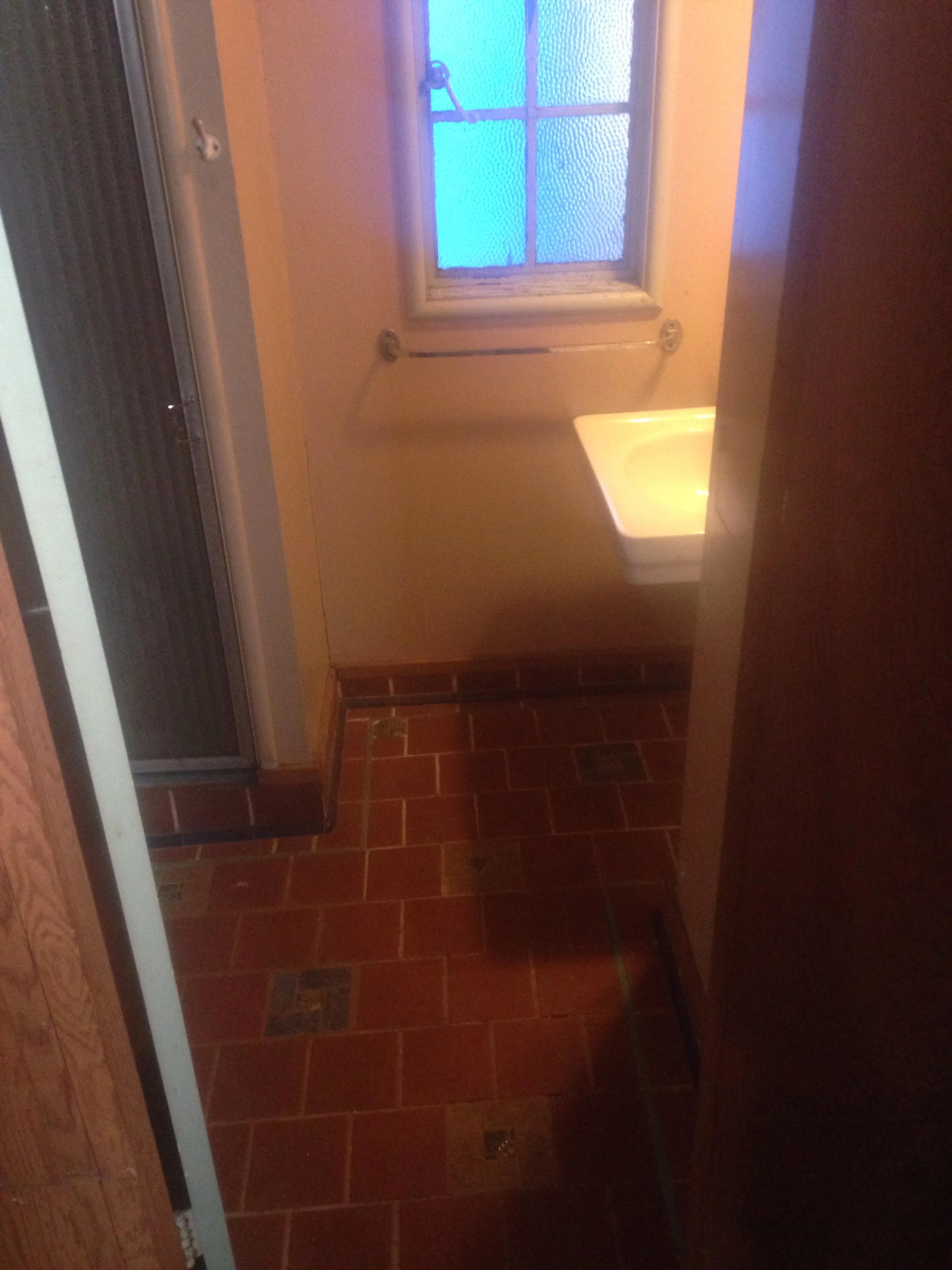
One thing that's odd is the bath has '20s plumbing fixtures. I'm still trying to figure out what has happened to this house over the years but the fixtures may be from an earlier upstairs half bath that was removed when the master dressing room was converted to master bath.


The wall sink fits well there so I'll simply shine it up.  The '20s wall tank toilet is a 5 gallon flush and will need to be replaced with a modern toilet. Unfortunately, the closet flange (floor drain) will need to be moved back from 16" to 12".

 
image.jpg
 

Above you can also see the floor was done in a style to mimic the downstairs bath and will be left for now. 

The ceiling is definitely not large timber redwood like the rest of the house and so will simply be painted fresh white as will the rest of the back addition with this ceiling.

 
image.jpg
 

Update:

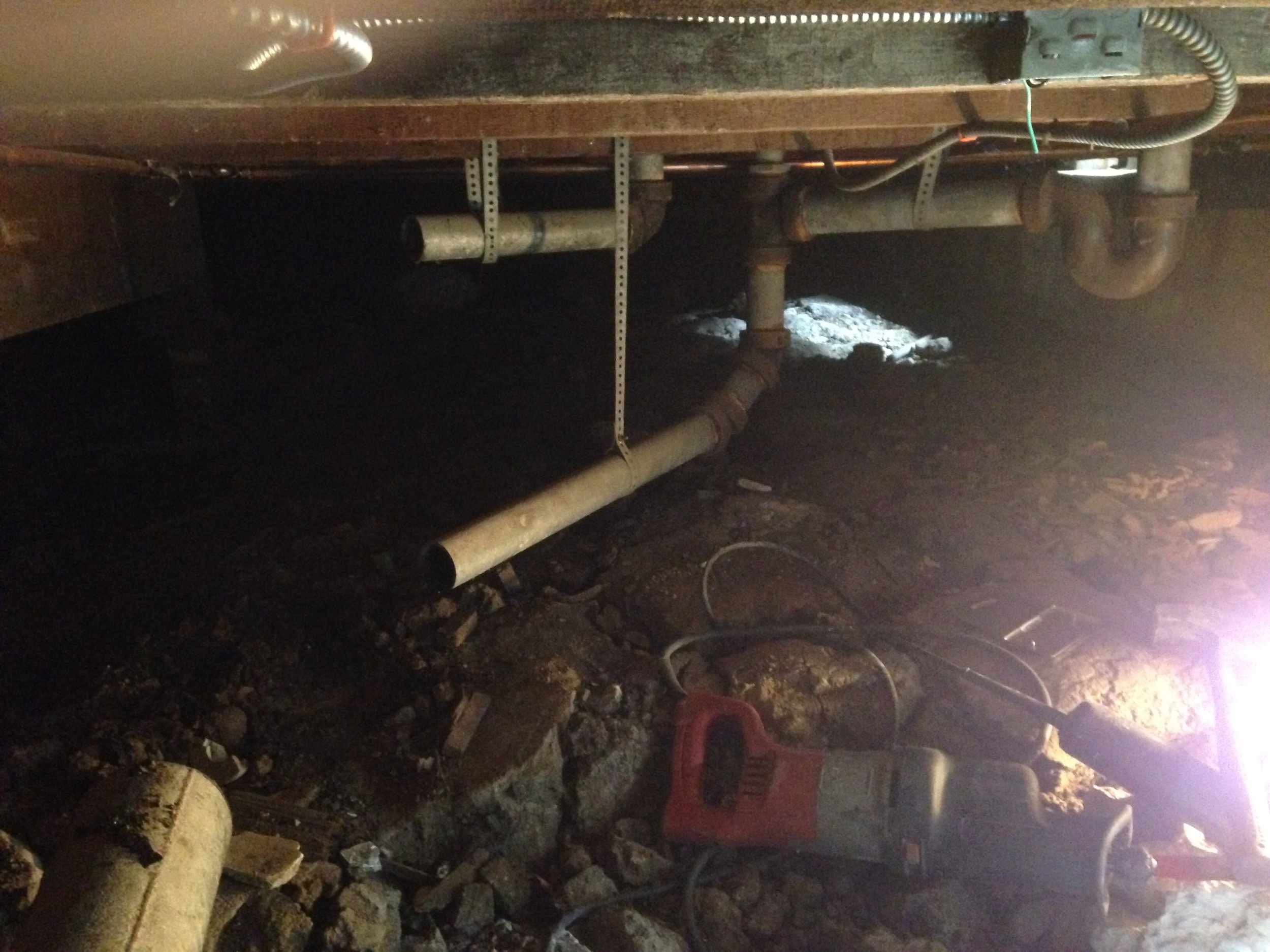
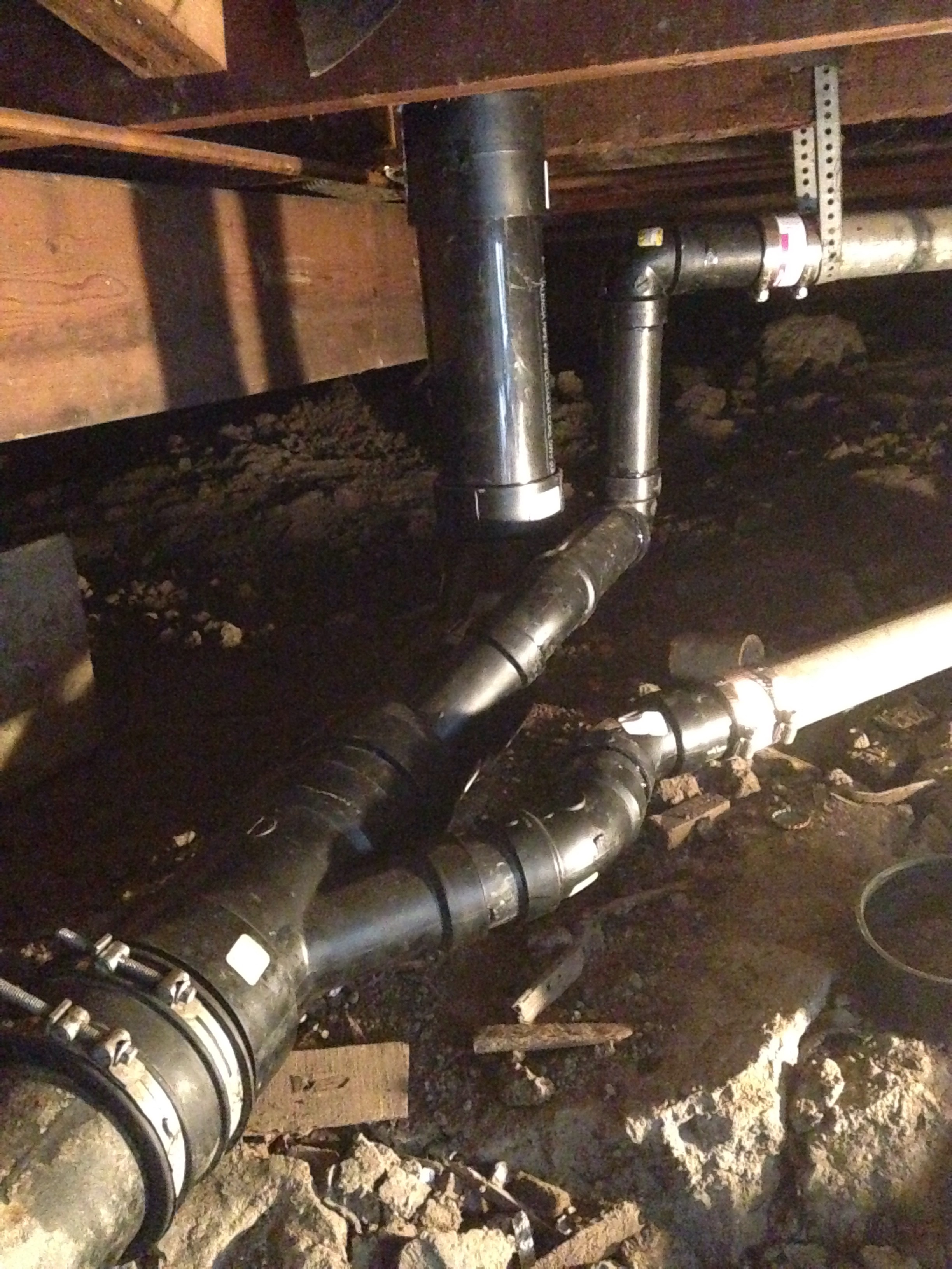
Back t the toilet... The vent for the toilet is wrong and I have to move back the toilet flange to accommodate a modern toilet so I'm redoing a large section.

image.jpg
image.jpg
image.jpg
image.jpg

Getting there...

Clockwise from top center: 4" toilet drain, 2" toilet vent, 2" shower drain

Clockwise from top center: 4" toilet drain, 2" toilet vent, 2" shower drain

The 2" vent is now correctly out of the path of water from the toilet flush going down the 4" pipe. The vent is just for displaced air which is why it can have hard bends. The foreground 2" pipe is the shower drain.

The 2" vent is now correctly out of the path of water from the toilet flush going down the 4" pipe. The vent is just for displaced air which is why it can have hard bends. The foreground 2" pipe is the shower drain.

 
It's pretty funny to see the tiny 1 gallon toilet tank next to the old 3-5 gallon wall tank toilet. 

It's pretty funny to see the tiny 1 gallon toilet tank next to the old 3-5 gallon wall tank toilet. 


Got the toilet in... 



Range Backsplash

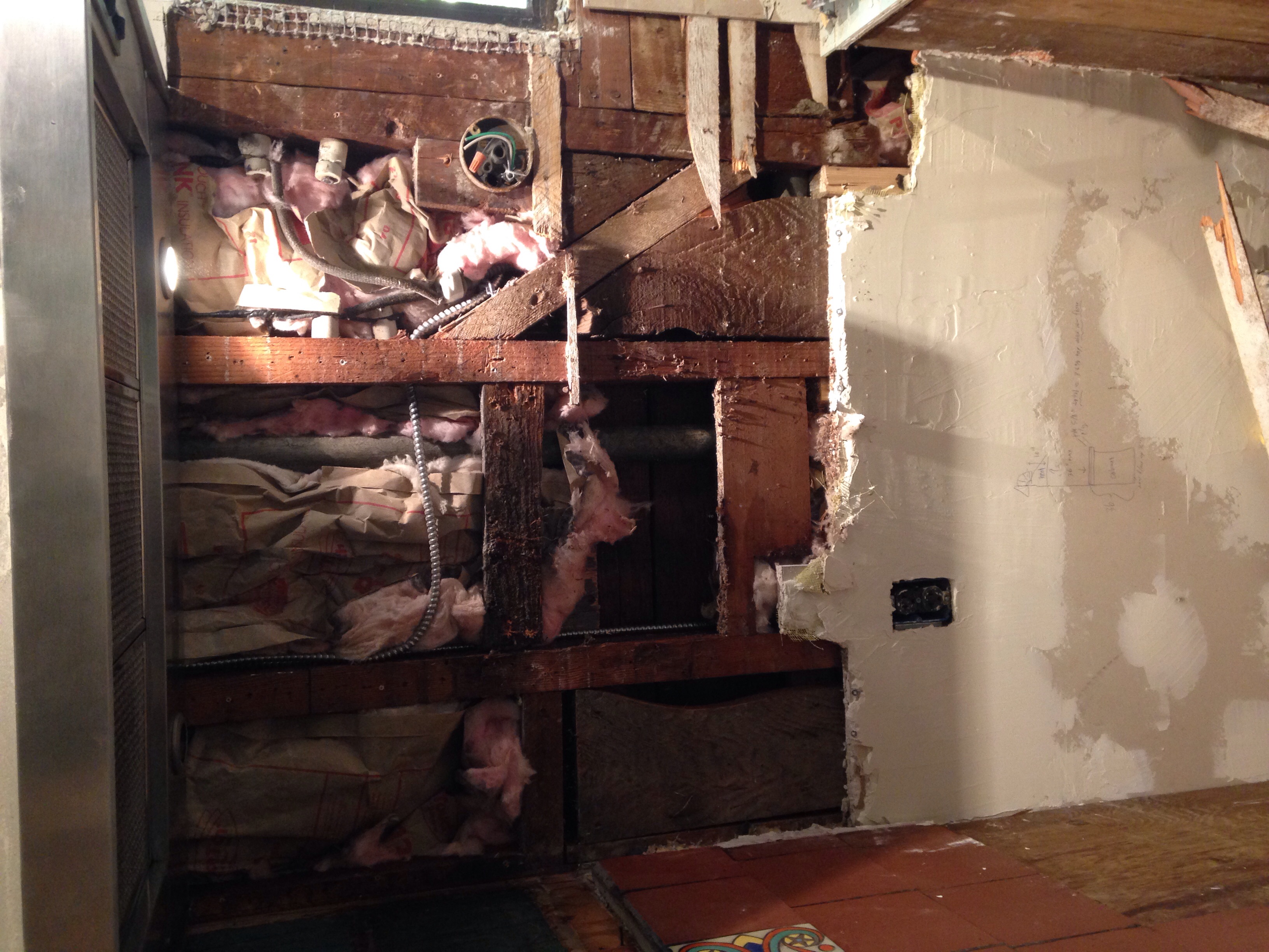
I added a hood above the range. It originally had nothing and then a homemade vent hood and it was greasy and sucky.  

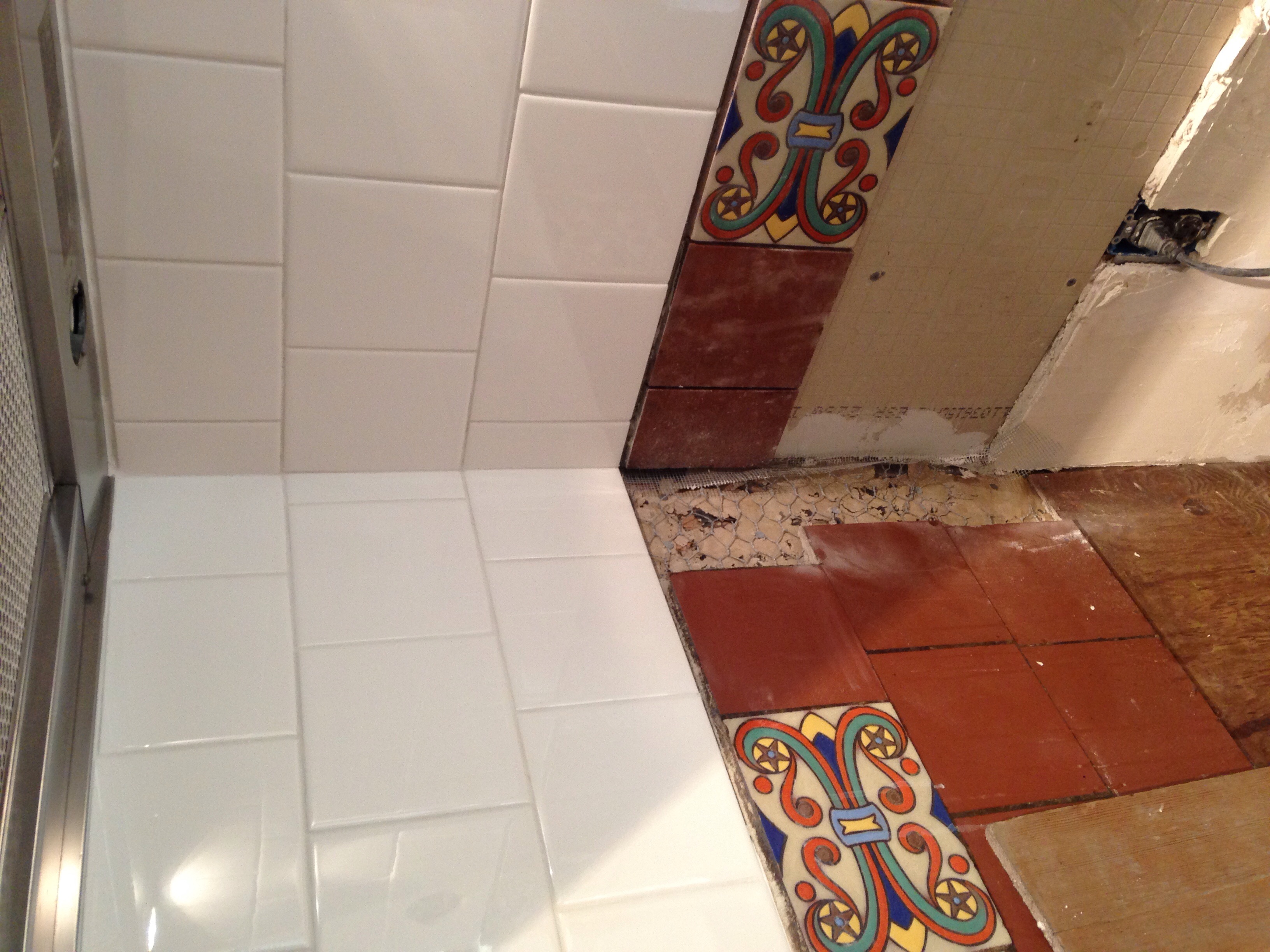
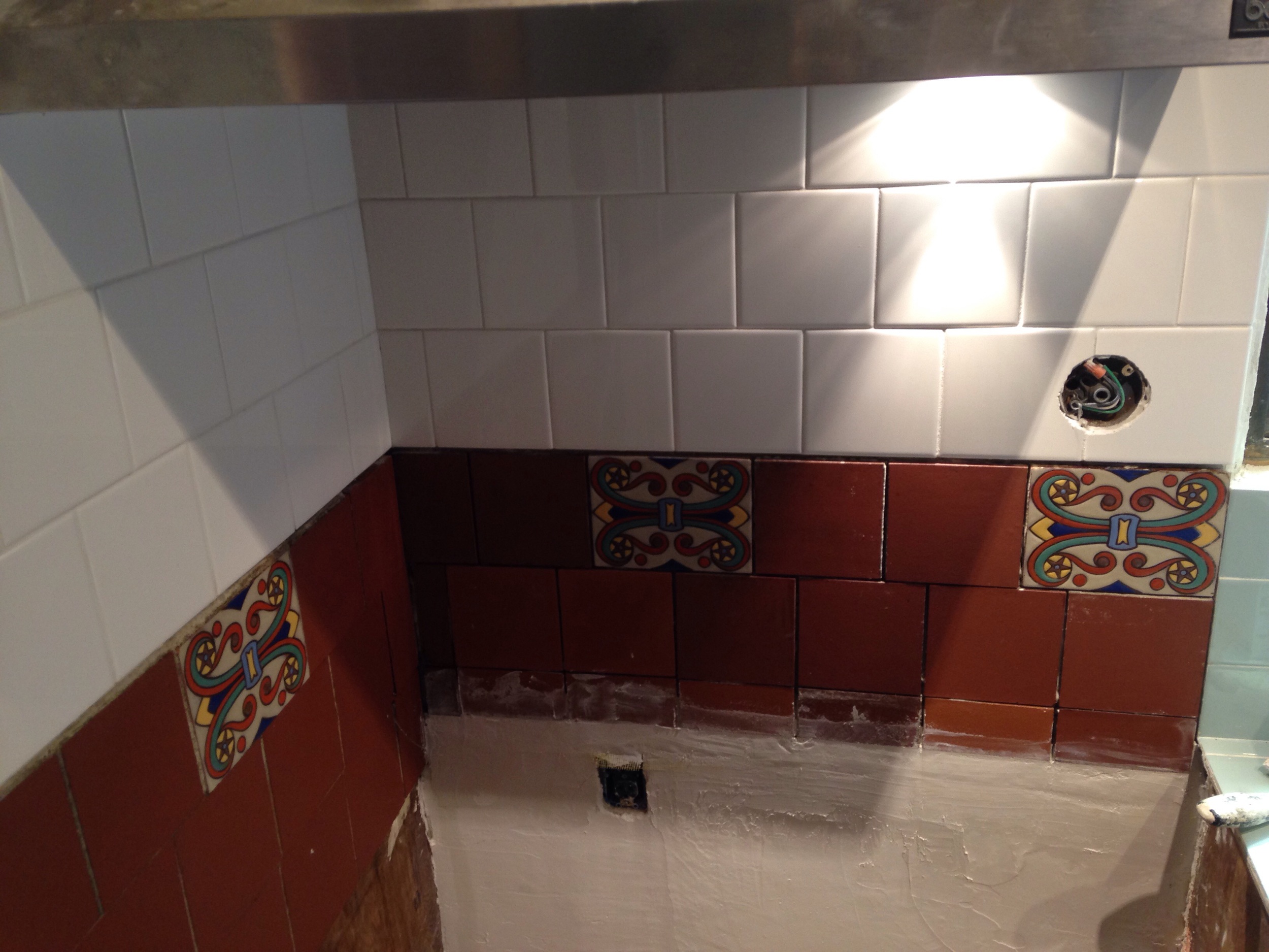
After adding a hood, I needed more backsplash tile up to the hood so that the grease from the cooking surface can be wiped down. I decided to make it match the bathroom tile I extended up when I raised the shower head. 

The tile was sticking out because it was done over the original backsplash which was a weird red painted cement thing

The tile was sticking out because it was done over the original backsplash which was a weird red painted cement thing

With the old backsplash removed, I can set the tile close to the wall

With the old backsplash removed, I can set the tile close to the wall

I put up two different thickness backerboard. 1/2" for the 6x6 because they are thin, about a 1/4". 1/4" hardibacker for the clay tiles since they are about 1/2" thick. This puts the tiles in the same plane.

I put up two different thickness backerboard. 1/2" for the 6x6 because they are thin, about a 1/4". 1/4" hardibacker for the clay tiles since they are about 1/2" thick. This puts the tiles in the same plane.

I did the white tile first so it is parallel with the floor and hood.  

I did the white tile first so it is parallel with the floor and hood.  

Clay tiles sitting in place for layout to match other side. I cut out tile for the wall light fixture because I decided to keep them as a theme like in the bathroom

Clay tiles sitting in place for layout to match other side. 

I cut out tile for the wall light fixture because I decided to keep them as a theme like in the bathroom

Set first row. Tiling down is not the natural way

Set first row. Tiling down is not the natural way

I had to carefully chip out the old mortar bed to reset the corner tiles since I moved the adjacent wall back

I had to carefully chip out the old mortar bed to reset the corner tiles since I moved the adjacent wall back

Got them all set. Also fixed the plaster.

Got them all set. Also fixed the plaster.

Here it's grouted.

Here it's grouted.

I used "natural grey" grout so hopefully it'll match the old stuff and look good behind the wedgewood.

Original Decorative Tile, '39 tile, '60s(?) tile

As you know if you have been following, there appears to have been three major phases of work:

1927-8: original construction, I'd guess 1200 square feet, 1 bedroom and the downstairs bathroom

1939: music room and breakfast nook added, changing room turned into master bath, probably crappy walk in master closet added (without permits and leaky) around this time (windows are single-light wood windows which would fit with this period). Garage seems to match the style of a Maybeck from this era (Wallen II house) and was probably added around this time as the rock fascia matches one put on the music room.

'50s and '60s: back bedrooms and upstairs bath ('50s I think), and linoleum in the kitchen and the last new roof '60s (last owner told me this). Also, I think the crappy master bedroom walk in closet probably had cabinets added because they cover the windows.

I have overlaid the permit records with the date of plumbing fixtures and rough estimates for stylistic features as well as information from the owner who grew up here whose parents bought it in 1960. He told me they did the roof at that time and added the linoleum in the kitchen. All the other work seems to line up with the three permits. 

Using the story I've put together, I can break the bathroom tile into three phases as well. 

1927: original downstairs bath tub and floor tile. In the notes it says the tiles are from Tunisia. 

LOVE these tiles. One of the features that sold me on the house  

LOVE these tiles. One of the features that sold me on the house  

I did an image search for Tunisian tiles and found this: 

The 1929 Santa Barbara Courthouse has one of the same tiles! It's not the exact same tile, but so similar. I think it's like Mexican crafts sold on the street - everyone makes their own clone of the same hand-painted maracas or more recently NFL themed day of the dead masks.

It appears that these Tunisian tiles were popular during the late '20s. 

Tunisian and Moroccan tiles are more the "Arabian" style of hand-painted decorative tiles than the hand-painted decorative Mexican tiles known as Talavera tiles. I was looking at both and though decorative tiles and terracotta tiles are common in both cultures, they have a notably different "feel." My house has North African style and therefore I should use that type when tiling the master bath.

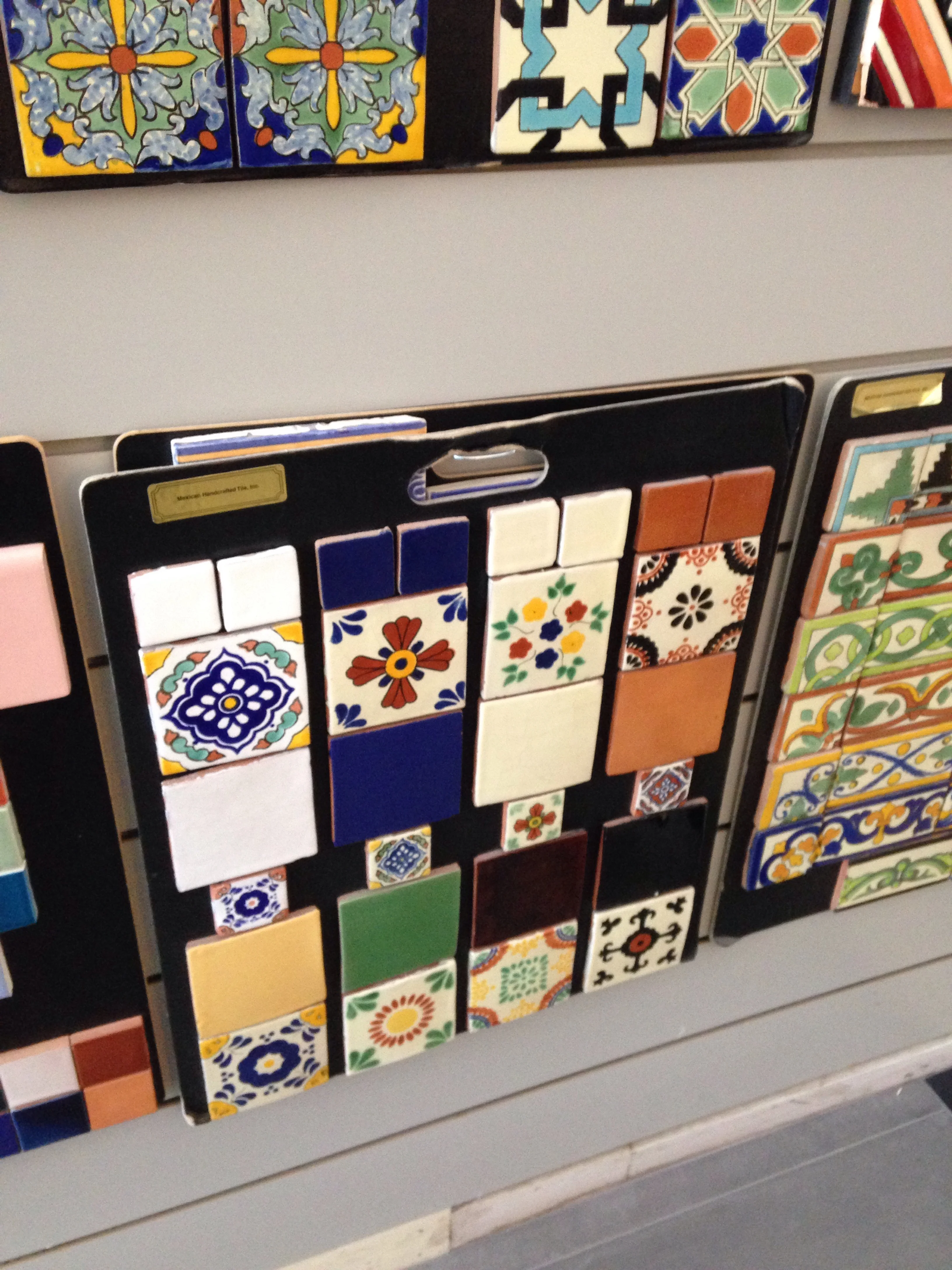
For reference, these are more Mexican looking tiles at Import Tile in Berkeley

For reference, these are more Mexican looking tiles at Import Tile in Berkeley

1939-40: These tiles may have been added later as they don't totally match the originals:

Here the circa '40 tile is next to a 4&1/4" square Dal-Tile spa tile. 

Here the circa '40 tile is next to a 4&1/4" square Dal-Tile spa tile. 

It seems odd the decorative tiles match ONLY above the floor. The clay tiles also seem a bit different color than the floor. This and other reasons make me think this base tile was part of a bathroom overhaul in '39

It seems odd the decorative tiles match ONLY above the floor. The clay tiles also seem a bit different color than the floor. This and other reasons make me think this base tile was part of a bathroom overhaul in '39

These tiles, and the 6x6" red clay quarry tiles (terracotta), were added to:​

-original bath as base tiles (like a baseboard)​ and around the tub which  may have had a low shower head added at this time

-behind the range as a backsplash​

image.jpg

-laundry sink backsplash​

image.jpg

It's possible that they are original but it seems odd the same accent tiles wouldn't be used throughout the original lower bath. 

I had to repair the range backsplash so I had to take off some tiles. The red clay quarry tiles were labeled "CARLYLE MADE IN U.S.A." and are very similar to the Red Blaze Quarry Tile made by Dal-Tile today. They probably used to be the same color too but they're porous and darken with age.

 Lighter tiles are new Dal-Tile quarry tiles


Lighter tiles are new Dal-Tile quarry tiles

'50s/'60s: some effort was put in to match the original bathroom tiles in the upstairs bathroom. But they are yet a third type of 6x6 clay tiles and accent tiles

Decorative tile is "hmmmm..."

Decorative tile is "hmmmm..."

They used Italian thin clay tiles and probably Dal-Tile trim pieces to match original but the accent tiles seem... off. 

I know these are a third type of tile because I found extras. The clay tiles are the thinner, more modern kind from Italy. 

I know these are a third type of tile because I found extras. The clay tiles are the thinner, more modern kind from Italy. 

Modern Italian clay tiles are thinner than the old clay tiles which are very thick  

Modern Italian clay tiles are thinner than the old clay tiles which are very thick  


Finally, the mid-century mosaic tiles. 

The wall tile looks '40 but the floor tile looks '60 as well as the shower door

The wall tile looks '40 but the floor tile looks '60 as well as the shower door

This marble linoleum tile was added at some point. It's over 1/4" ply which may be on top of wood or... 

This marble linoleum tile was added at some point. It's over 1/4" ply which may be on top of wood or... 

Here is the mid-century bath.  The tile is made to match the lower bath but the trim is definitely mid-century

Here is the mid-century bath.  The tile is made to match the lower bath but the trim is definitely mid-century

The door and shower pan match the master bath and both seem wrong for the house 

The door and shower pan match the master bath and both seem wrong for the house 

So there you have it! 3 phases of work, three sets of tiles, and some other crap thrown in too! I'm doing this research to help develop my design for the master bath tile and upper bath shower repair. I am looking for consistency here! I need to unify the design of the house. A big part of my job when working on old houses is to peel back the dated, halfbaked "improvements" and to remodel and restore the house by using the original style as a guide as much as possible. I think Maybeck had a hand in the '39 addition so I will respect those features as well. I have decided to make the master bathroom look '27 even though it was originally a changing room. I'm looking forward to that!

The tub I want to add to the master bath from VintageTub.com

The tub I want to add to the master bath from VintageTub.com

Kitchen Tile Countertop

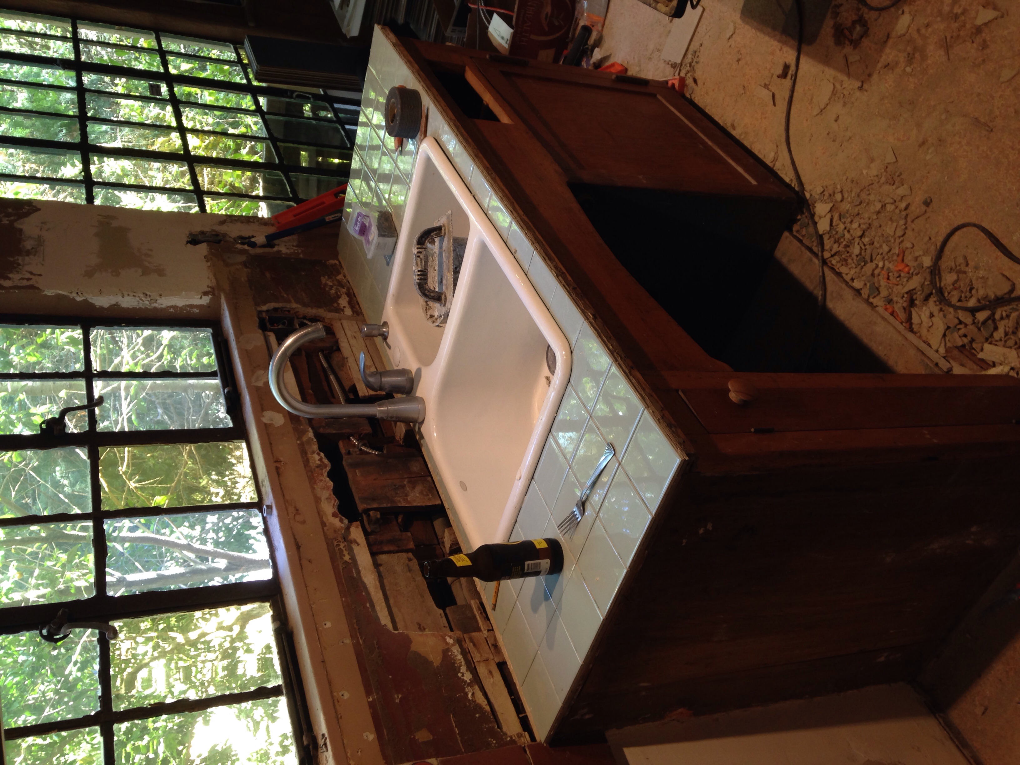
I'm throwing together a kitchen countertop with leftover tiles and a cast iron sink from Craigslist I got for $25. Ultimately I would like something fancy like slate but this will do for now. 

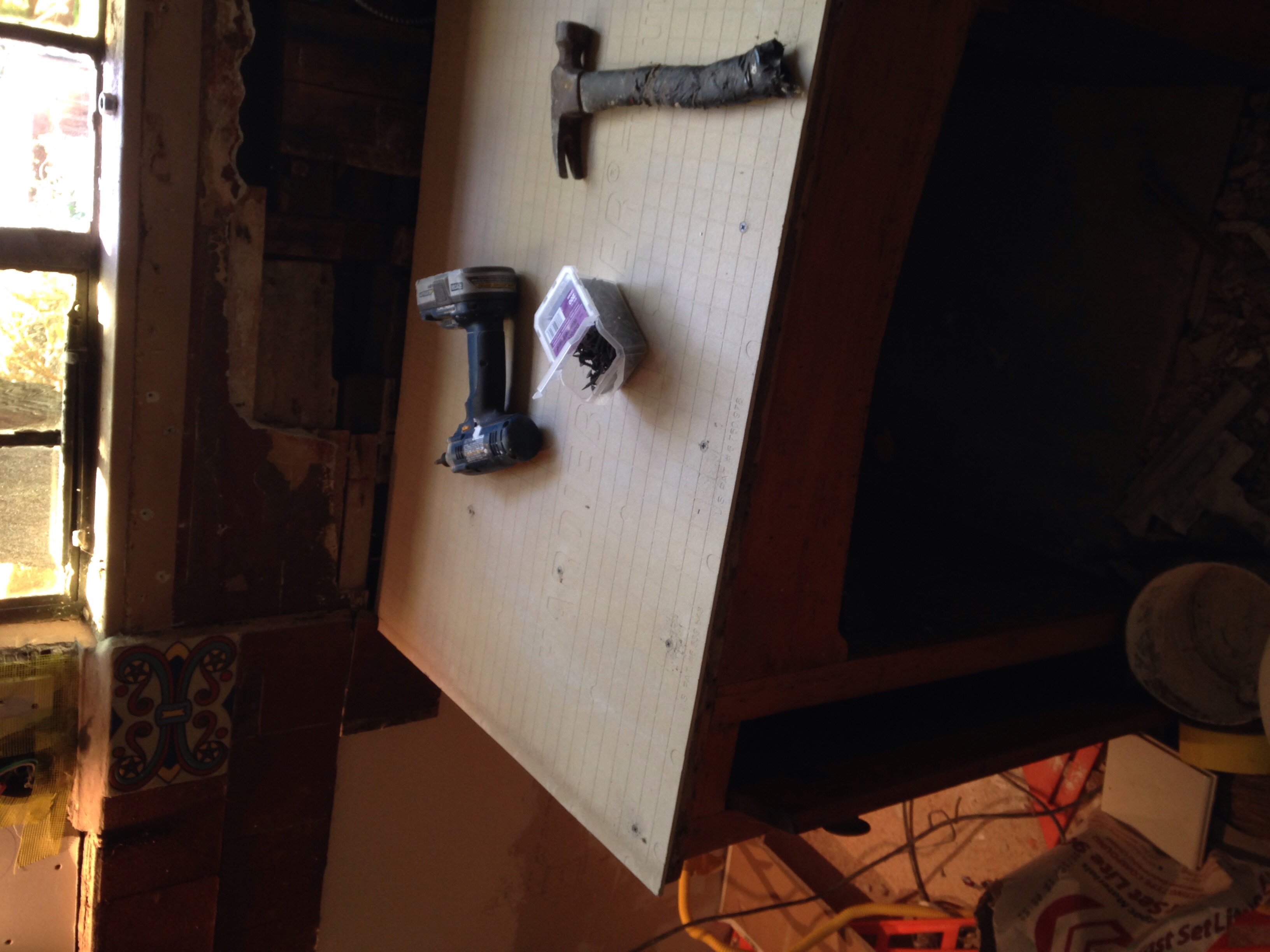
Screwing down the hardibacker to the 3/4" ply that was under the linoleum

Screwing down the hardibacker to the 3/4" ply that was under the linoleum

Cut the sink in... The rough opening (hole) had to be just 1" wider

Cut the sink in... The rough opening (hole) had to be just 1" wider

Layout looks good

Layout looks good

I used the built in spacers for a 1/16" grout joint. If you push the tiles close together there's an automatic grout space

I used the built in spacers for a 1/16" grout joint. If you push the tiles close together there's an automatic grout space

I did this super fast. It was one of the easiest projects so far. Now I get to have a beer

I did this super fast. It was one of the easiest projects so far. Now I get to have a beer

Wow that was pretty easy! Sweet. 

image.jpg

As a side note - the sink originally had two bowls, a wall mount faucet, and two soap dish things. The backsplash appears to have been terra cotta painted mortar(?) to match the red tiles behind the stove. 

Grouted

Grouted