What would a late period Maybeck design look like? CED Archive field trip

Caution: contains rampant but reasoned speculation.

From Kenneth Cardwell's book Bernard Maybeck / Artisan, Architect, Artist

"In his later years, Maybeck concentrated on basic design schemes and decorative effects while relegating the actual structural planning to other architects. The results were usually dramatic but less unified and effective than his earlier work."

This gives insight into the process that may have created our house. Christina and I went on a little field trip to the Berkeley College of Environmental Design Archives to look at the plans for Maybeck's Aikin house, 1940. Maybeck essentially retired after this year, and the Aikin plans are notable for not having his name on them but he was seen in some construction photos. Sort of like our house, but without the plans or photos:(

Though pictures are not allowed to be published from the archives without permission, we were able to handle the Aikin associated drawings and look them over for signs of the process.

The floor plans were very minimal and mostly only listed rooms, doors, fireplaces, stove and sink in the kitchen - the bare bones. The elevations, straight-on flat perspective drawings of the exterior walls, were also quite limited and only depicted doors, windows and roof lines.

Being a builder, I understand that these drawings were intended to be the basis of an architectural or structural design. In our case, I believe Rowland, the builder of record, may have been responsible for these structural designs which could probably have been done in the field using standard building practices of the day. These days an engineer is required for foundation and shearwall and structural beams but these requirements were probably much less strict at the time. This is why houses from the '20s are usually in such bad shape these days as best practices in long term stability and earthquake safety have come about more recently. Maybeck was no longer the architect in his works after 1924 but instead the designer. The disconnect between the designer, the architect or builder, and the building department is why I believe there are a few undocumented Maybeck houses from this period. Another notable Rowland project that looks to be designed by Maybeck was the 1926 Reid house in Berkeley. I hope both my house and the Reid house can one day be connected to Maybeck.

With the basic size and shape of the house determined by the floor plans and elevations, one could probably get a building permit and start the foundation work and the framing. The reason I think Maybeck designed the shape of the house, besides the Rowland letter, is his use of changes in floor and ceiling heights to create interior magic. A tucked away front door, perpendicular to the street and far up the hillside, opens to a small, low entry room with a tiny door into the only original bathroom. To the right opens up to a dramatic sunken living room with 1&1/2 story high redwood ceilings and oversized board formed concrete central fireplace with Venturi chimney. Through the living room you enter the kitchen which is back up to the level of the entry way and the ceilings come back down. This creates an "Alice in Wonderland" effect in the living room that is dramatic and interesting and a central feature of many of Maybeck's works. A staircase winds around above the living room to enter the only original bedroom. The balcony over the living room again creates the growing and shrinking Alice in Wonderland effect as you go from a narrow stairwell back to the large living room, back to a narrow stairwell that goes into an oversized single (original) bedroom with a Victorian-esque changing room and observation deck. A Maybeck expert would hear these things and think Maybeck. An average architecture fan would probably think "storybook" or Hansel and Gretel style although those are not quite accurate.

The exterior of the house in a Swiss Chalet style combined with the interesting use of space and the unusual floor plan is very much a Maybeck design. The interior redwood trim work is also something Maybeck would have designed with collaboration from Rowland, who hand carved all the redwood door handles. Maybeck probably designed the floor, which was random width tongue and groove redwood with hardwood plugs and a special filler for the V between the redwood boards. The random width planks with hardwood plugs are seen on other Maybeck's but I don't know of him using redwood flooring in any other projects.

One thing that has muddied the picture of a pure, unadulterated Maybeck design is the tile work in the house which is probably not Maybeck and was probably added a bit later. The kitchen and bath would have been quite sparse originally and may not even have had tile. The Wallen house #1, 1933, looks to have had black 4&1/4" dal-tile added in the kitchen and bath as well.

Back to the design process...

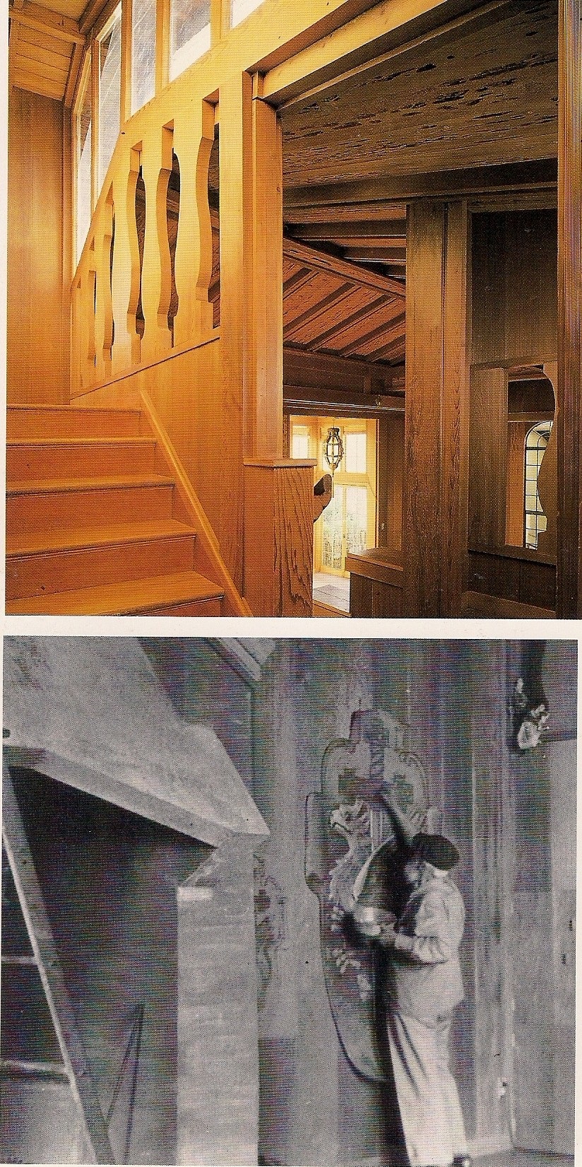
After the house was being built, he would probably stop by to visit and direct certain details about the construction as he is seen doing in a picture from the Aikin house. He would probably have made sketches of interior details such as the fireplace and the doors of the house. The material finishes would have been listed on the floor plans or discussed on site. Mostly the finish details that were listed on the floor plans would likely be information relevant to the framers of the house.

These are the jobs of a home designer, not an architect. Rowland would have been responsible for dealing with the inspections and building department which is why he is listed on the official documents.

We also know from the Rowland letter that there was a landscaping design. Maybeck did some landscaping designs and also hired other people for that. I think what is left in our yard is a very overgrown and not well maintained original landscaping design.

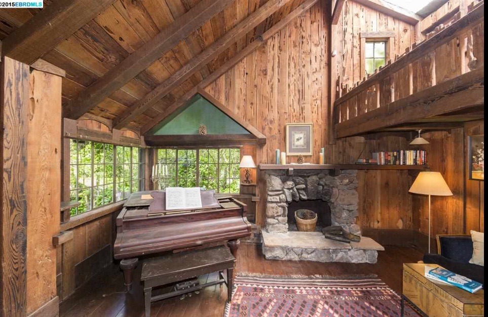
In 1939, Rowland came back to the bay area to do two additions on the house. They were made of pecky cedar and their general form looks to be done from a Maybeck sketch. Maybeck was near retirement and back and forth between Berkeley and Twain Harte with Annie. It's likely that Rowland would have come to visit his old friend Maybeck in Berkeley and have him give guidance for the additions. This may have been done off site. The pecky cedar is one clue that Maybeck was involved. Another clue is the breakfast room added off the kitchen which Maybeck had added to other projects. Increased kitchen area was something that became more desirable through the middle of the century. Another clue was the care to "elevational" magic in the music room which had an odd series of modernist skylights made of wire glass similar to those seen on the Aikin house of 1940 which also used the pecky cedar throughout. The reason I think it was a Maybeck sketch is the overall care to detail is reduced and the fireplace in the music room was faced with cobblestones which is a design Maybeck hadn't used for many decades. The skylights were also poorly implemented and leaked quite a bit over the years. With Maybeck probably not supervising the building process, the quality was reduced.

The two bedroom one bath addition in the very back of the house was done in '47 and is a poor attempt at matching the style of the house. These were done by a different owner and builder than the Rowland/Maybeck team.

If my speculations are correct then we have a Maybeck house with "half a Maybeck" additions in '39 and some crap added to the back in '47. This makes our house about 50% Maybeck by square footage and that creates the opinion of some that it is a watered down design and was a Maybeck copy done by his friend Rowland. It has been difficult to explain this story to experts as the layers of work over the years have created a lot of confusion and the more likely story requires exhaustive research to understand. Finding one more scrap of evidence relating to the house with Maybeck's name on it would help triangulate the wealth of late period Maybeck details with the Rowland letter where he says it was a Maybeck design. Unfortunately, the Maybeck papers at the CED archives are highly guarded and somewhat disorganized. A sketch of a detail of our house could easily be sitting in a box of miscellaneous papers at the CED archives that are uncategorized or tucked into a folder relating to another project. I might have to reach out to an author of one of the Maybeck books I have to see if there are any curious drawings they have seen in their research in the CED archives that might help piece this story together.

This sums it up quite nicely:

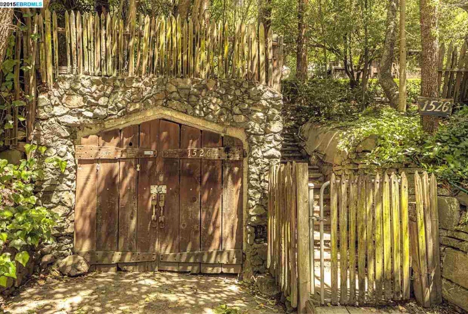
"This highly unusual Montclair Swiss chalet is packed full of heavy timbers and interesting embellishments. The home is attributed in the listing to “Rowland” which we presume refers to the little known Berkeley design-builders Rowland & Rowland, but this structure is particularly flamboyant even by their standards. The attention to detail and unity of vision here rivals that of any of the best known and most idiosyncratic of Bay Area designers."

From: https://edificionado.wordpress.com/2014/04/29/1526-mountain-oakland/

 

Maybeck Feature: Stucco Splatter

I didn't notice at first, but the house has an odd textured stucco splatter. This was a technique that only Maybeck used to my knowledge. It is one of my strongest pieces of evidence since it is so unusual and featured on confirmed Maybecks.

From the Berkeley Architectural Heritage Association: 

Daniella Thompson, BAHA 2006. Joralemon House, 1924

Daniella Thompson, BAHA 2006. Joralemon House, 1924

Ira B. & Dorothy Joralemon House
168 Southampton Avenue
(Bernard Maybeck, 1924)

"As part of a remodel of Bernard Maybeck’s 1924 masterpiece, the new owners rose to the challenge of restoring the unique, original exterior coating. Maybeck had prescribed “earth color,” a composition intermingling four colors of wet stucco—pale chrome yellow, deep ochre, Venetian red, and gray—to be spattered on the walls in turn. At Maybeck’s direction, the young Joralemons dipped whisk brooms into the mix and flipped them toward the walls, which scattered the colored stucco, creating what Maybeck called “vibrant colors.”

"About 15 years ago, because of cracking in the original finish, the exterior was covered with a layer of commercially sprayed stucco. Hidden behind a planter pot by the front entrance, the new owners found a patch of the original finish and color, and sought to recreate the look and technique, but more efficiently executed with sprayed paint.

"Faced with this intriguing challenge, their painting contractor enlisted the aid of a decorative painter known for her faux finishes. With air compressor, sheetrock hopper guns, and hoses, 100 gallons of paint were flung at the thousands of square feet of wall. After trial and error, the technique was refined and mastered, including brushes and sponges in the capable hands of the faux finisher. The result was a spectacular success, replicating the original look and returning Maybeck’s touch to the exterior of this very striking house."

-Berkeley Architectural Heritage Association 

http://berkeleyheritage.com/awards/awards2006.2.html

In the front of the house it looks like black speckle. I breezed by assuming it was mildew or something.


In protected areas, like under the kitchen balcony, it appears more pronounced. 


This small area off the laundry has some added colors:


Seen here is the black that's all over and a couple colors you can't see anywhere else - a buttermilk color and a terracotta red. It's hard to tell what was the intended effect of having more colors there. Best guess would be to blend with colors in the landscaping.

 
I even see the splatter on the original electrical permit which was in a box on the side of the house near the crawl space door! The first two sets of permits were under here. Looks like the electrical permit was near a gap in the door that covers t…

I even see the splatter on the original electrical permit which was in a box on the side of the house near the crawl space door! The first two sets of permits were under here. Looks like the electrical permit was near a gap in the door that covers the meter box.


Maybeck also used this type of splatter on the Oakland Packard dealership though this building is no longer around. 

"The dull surfaces of plastered walls never appealed to [Maybeck] and when he used stucco for reasons of economy he always attempted to enrich is by some means. The Jockers house (1911) had rough cast and contrasting troweled surfaces; the Kennedy studio used variously colored plasters without restraint. Most late houses, like the McMurray and the Staniford, had stucco exteriors modeled in several colors of plaster applied in successive dash coats. This method... produced a lively finish. But the hand-controlled application was not economical for use on large structures. A new technique, which covered concrete surfaces with a coat of plaster blown by air guns, took quantities of cement, pigment, and water, and mixed them as they were driven against the surface of the building. Maybeck saw that with this method he could vary the pigmentation of the plaster almost at will. He did so on the Oakland [Packard Dealership] building, first stationing himself across nearby Lake Merritt where he conducted the finishing operations by field telephone." Kenneth Cardwell from Bernard Maybeck / Arisan, Architect, Artist.

To sum up - the colorful stucco splatter is a distinctly Maybeck feature like the Venturi chimney. From what I can tell, the specific whisk broom splatter was done only in the '20s and only to dress up flat stucco exteriors (Maybe 3/4 or more of his projects from the -period were stucco). The Wallen #1 (1932) and J.B. Tufts #3 (1931) of the early '30s are simply plain stucco it appears.

I was lucky enough to see the 1921 Calkins house, and it seems like it is one of the few left with this finish that has not been painted. 

image.jpg
image.jpg
The streak is from a gutter that was in disrepair. 

The streak is from a gutter that was in disrepair. 

Maybeck Features '39 - Why I think the first addition was based on a Maybeck sketch

In my opinion, evidence is strong that the original 1927 house was designed by Maybeck. Less certain is his possible involvement in the first addition in '39. 

If Maybeck was involved, it would have been one of the last residential projects he ever worked on before retiring and that would be consistent with his tending toward informal sketches in his older age.

The main evidence relating to Maybeck's involvement is the strong similarities to the last residential project he did, the Aiken House, 1940.

The addition consists of a 9x12' dining nook off the kitchen, a music room with a grand piano, and a detached garage. 

THE PECKY CEDAR:

image.jpg

The breakfast nook and the music room are COVERED with this odd material - boards salvaged from trees already half eaten by beetle larvae(?). The result is large passages through the wood like what you might have with a bad carpenter bee problem. Both rooms and the confirmed Maybeck Aiken House, built right after this addition, are totally covered in the stuff. He used this type of material starting in the early '30s to the end of his career. I have not seen this material used outside of his projects so it could be something he special ordered for his projects.

THE GRAND PIANO:

image.jpg
Weber serial 59XXX dates to 1905-1910. from: https://en.m.wikipedia.org/wiki/Weber_Piano_Company

Weber serial 59XXX dates to 1905-1910. 

from: 

https://en.m.wikipedia.org/wiki/Weber_Piano_Company

The grand piano was built into the house, likely put in before the walls were closed since there is no other way to get it into the house. Maybeck seemed to put grand pianos in every house in the '30s. Maybe he had a piano guy with good deals...

image.jpg
image.jpg
image.jpg
image.jpg

*THE WEIRD SKYLIGHTS*:

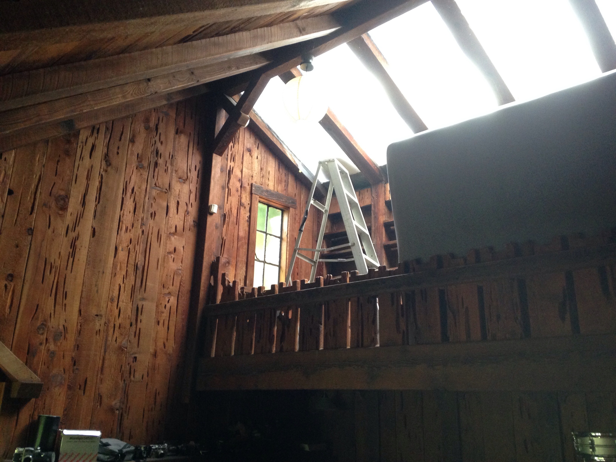
The most interesting feature by far is the weird and ugly modernist skylights, originally made from wire glass as it says on the permit.

image.jpg
There is a little bit of the wire glass left.

There is a little bit of the wire glass left.

The Aikin house has a weird modern skylight too but it came in 1940

The Aikin house has a weird modern skylight too but it came in 1940

The reason I think this piece of evidence is very interesting is because the conspiracy theory would be Rowland, the builder, who worked with Maybeck before, just copied his style. BUT YOU CAN'T COPY SOMETHING THAT HASN'T BEEN DONE YET!!!

THE GARAGE: 

The garage was likely built in 1940, after the additions were done. It's not on the permit for the 1939 addition but it is listed as existing on the next permit.  The reason I think it was built in '40 is it's very Maybeck looking and has a fascia rock that matches the music room that's on the permit. I'm thinking they built it right after the inspector left in 1940.

image.jpg
image.jpg
Part of the modern movement, brick and stone fascia was pretty hot in 1940-60s like on this apartment from '40 which was discussed earlier.

Part of the modern movement, brick and stone fascia was pretty hot in 1940-60s like on this apartment from '40 which was discussed earlier.

GOTHIC ARCH IN BOARD FORMED CONCRETE:

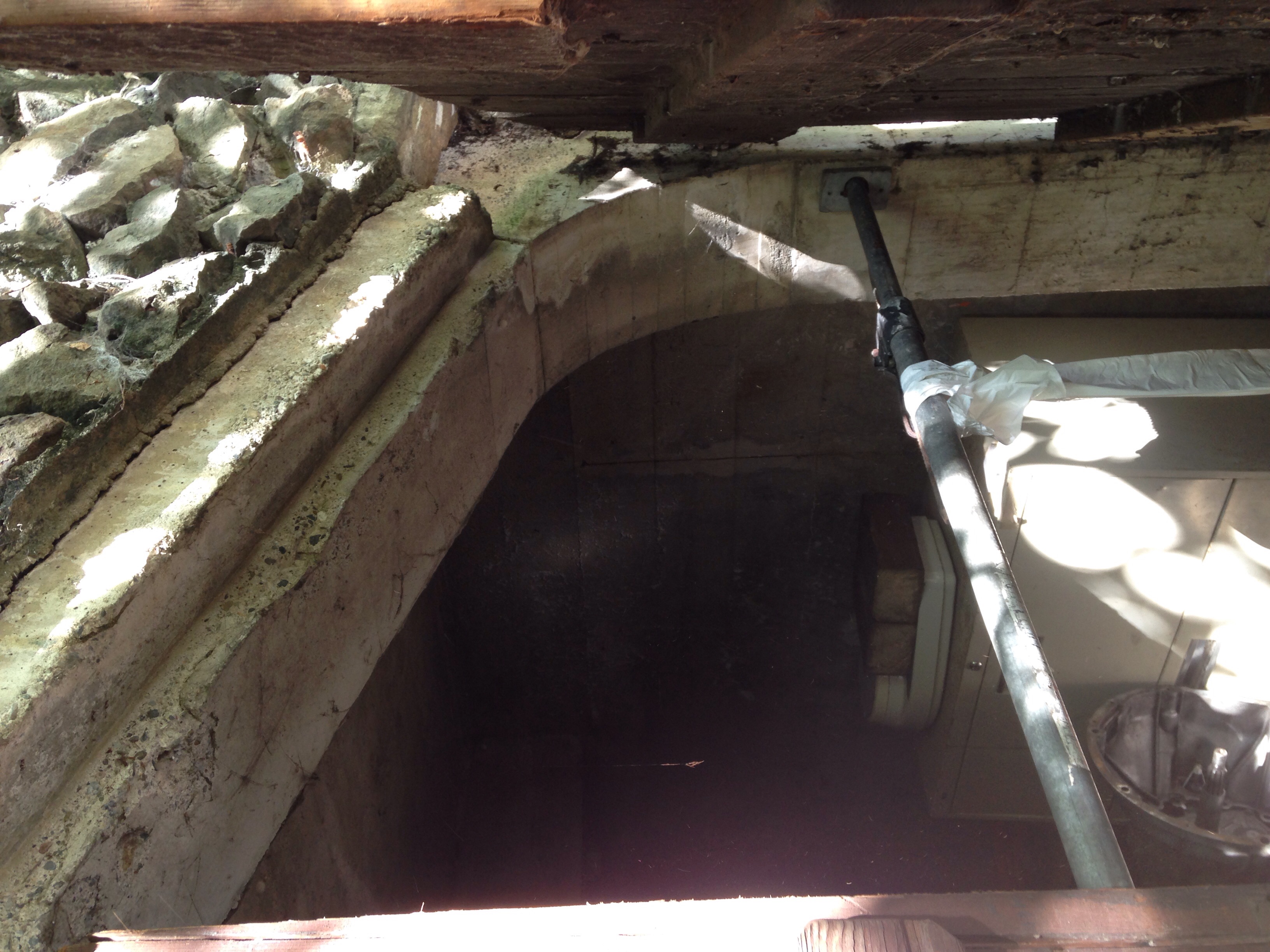
The gothic board formed concrete arch is very Maybeck. 

image.jpg
image.jpg
image.jpg

It occurs over and over in his work. Like here: 

image.jpg

And here: 

image.jpg

And here: 

image.jpg


And here: 

image.jpg


And here: 

image.jpg

GARAGE ROOF PATIO: 

image.jpg

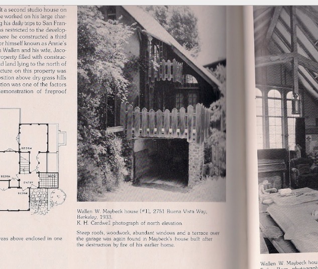
 The fence above the garage can be seen on Maybeck's Wallen I house, 1933 (Caldwell book).

image.jpg

You've got to admit that is a compelling case! Or at least that there are a lot of strange coincidences.

To sum up:

-odd pecky cedar materials

-grand piano

-modern skylight

-board formed concrete gothic arch over garage

-garage top patio fenced in

Original Decorative Tile, '39 tile, '60s(?) tile

As you know if you have been following, there appears to have been three major phases of work:

1927-8: original construction, I'd guess 1200 square feet, 1 bedroom and the downstairs bathroom

1939: music room and breakfast nook added, changing room turned into master bath, probably crappy walk in master closet added (without permits and leaky) around this time (windows are single-light wood windows which would fit with this period). Garage seems to match the style of a Maybeck from this era (Wallen II house) and was probably added around this time as the rock fascia matches one put on the music room.

'50s and '60s: back bedrooms and upstairs bath ('50s I think), and linoleum in the kitchen and the last new roof '60s (last owner told me this). Also, I think the crappy master bedroom walk in closet probably had cabinets added because they cover the windows.

I have overlaid the permit records with the date of plumbing fixtures and rough estimates for stylistic features as well as information from the owner who grew up here whose parents bought it in 1960. He told me they did the roof at that time and added the linoleum in the kitchen. All the other work seems to line up with the three permits. 

Using the story I've put together, I can break the bathroom tile into three phases as well. 

1927: original downstairs bath tub and floor tile. In the notes it says the tiles are from Tunisia. 

LOVE these tiles. One of the features that sold me on the house  

LOVE these tiles. One of the features that sold me on the house  

I did an image search for Tunisian tiles and found this: 

The 1929 Santa Barbara Courthouse has one of the same tiles! It's not the exact same tile, but so similar. I think it's like Mexican crafts sold on the street - everyone makes their own clone of the same hand-painted maracas or more recently NFL themed day of the dead masks.

It appears that these Tunisian tiles were popular during the late '20s. 

Tunisian and Moroccan tiles are more the "Arabian" style of hand-painted decorative tiles than the hand-painted decorative Mexican tiles known as Talavera tiles. I was looking at both and though decorative tiles and terracotta tiles are common in both cultures, they have a notably different "feel." My house has North African style and therefore I should use that type when tiling the master bath.

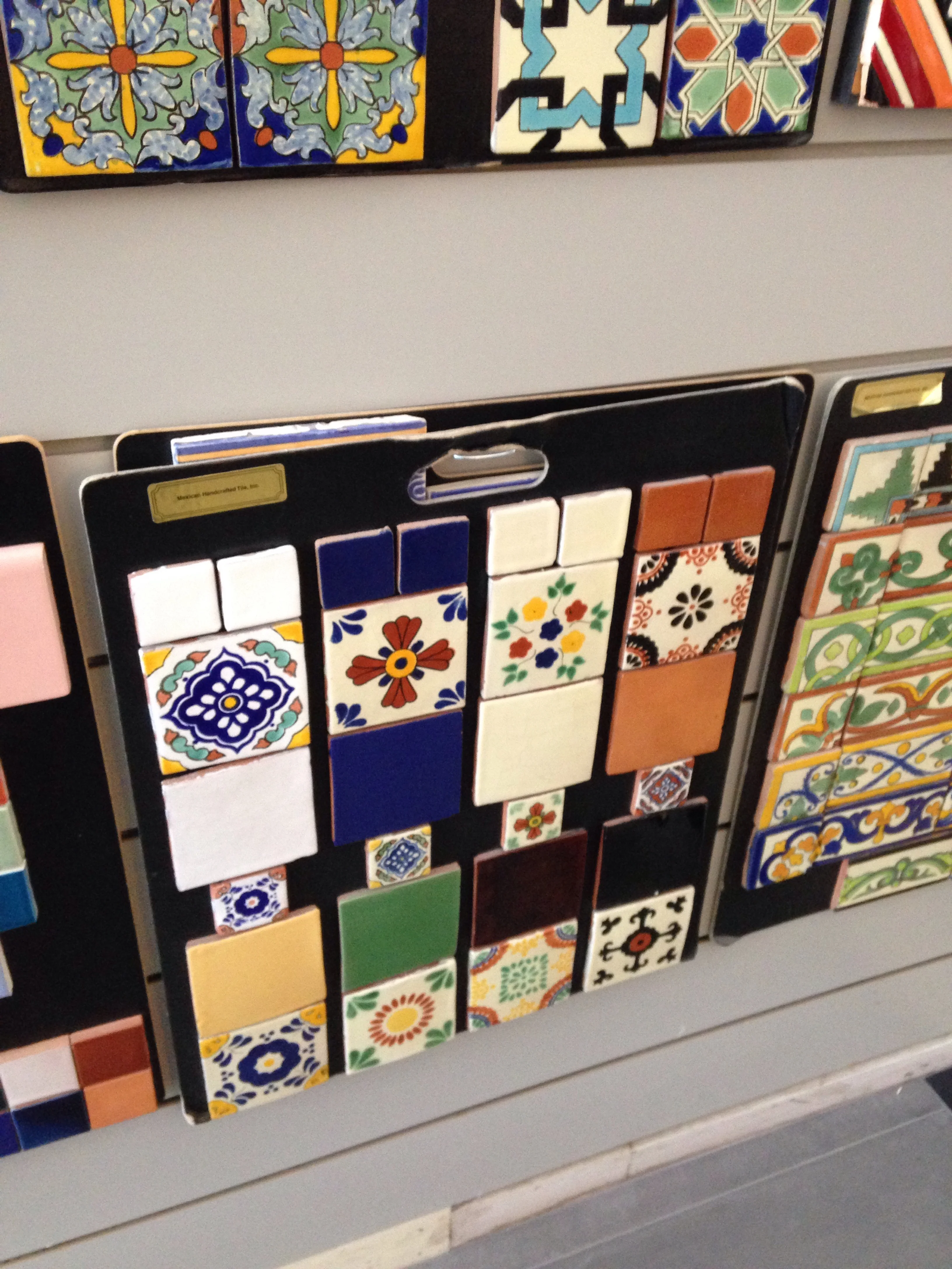
For reference, these are more Mexican looking tiles at Import Tile in Berkeley

For reference, these are more Mexican looking tiles at Import Tile in Berkeley

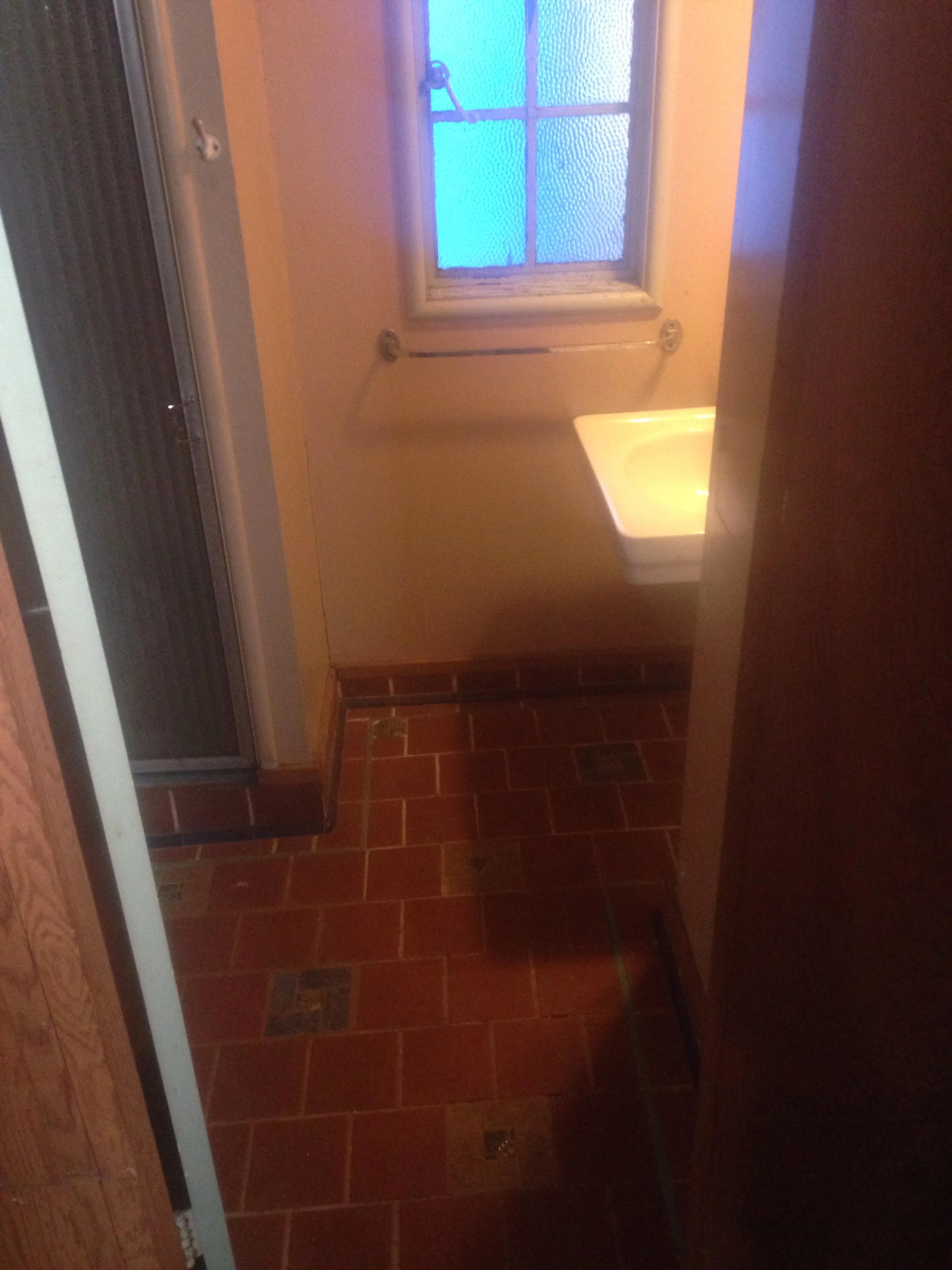
1939-40: These tiles may have been added later as they don't totally match the originals:

Here the circa '40 tile is next to a 4&1/4" square Dal-Tile spa tile. 

Here the circa '40 tile is next to a 4&1/4" square Dal-Tile spa tile. 

It seems odd the decorative tiles match ONLY above the floor. The clay tiles also seem a bit different color than the floor. This and other reasons make me think this base tile was part of a bathroom overhaul in '39

It seems odd the decorative tiles match ONLY above the floor. The clay tiles also seem a bit different color than the floor. This and other reasons make me think this base tile was part of a bathroom overhaul in '39

These tiles, and the 6x6" red clay quarry tiles (terracotta), were added to:​

-original bath as base tiles (like a baseboard)​ and around the tub which  may have had a low shower head added at this time

-behind the range as a backsplash​

image.jpg

-laundry sink backsplash​

image.jpg

It's possible that they are original but it seems odd the same accent tiles wouldn't be used throughout the original lower bath. 

I had to repair the range backsplash so I had to take off some tiles. The red clay quarry tiles were labeled "CARLYLE MADE IN U.S.A." and are very similar to the Red Blaze Quarry Tile made by Dal-Tile today. They probably used to be the same color too but they're porous and darken with age.

 Lighter tiles are new Dal-Tile quarry tiles


Lighter tiles are new Dal-Tile quarry tiles

'50s/'60s: some effort was put in to match the original bathroom tiles in the upstairs bathroom. But they are yet a third type of 6x6 clay tiles and accent tiles

Decorative tile is "hmmmm..."

Decorative tile is "hmmmm..."

They used Italian thin clay tiles and probably Dal-Tile trim pieces to match original but the accent tiles seem... off. 

I know these are a third type of tile because I found extras. The clay tiles are the thinner, more modern kind from Italy. 

I know these are a third type of tile because I found extras. The clay tiles are the thinner, more modern kind from Italy. 

Modern Italian clay tiles are thinner than the old clay tiles which are very thick  

Modern Italian clay tiles are thinner than the old clay tiles which are very thick  


Finally, the mid-century mosaic tiles. 

The wall tile looks '40 but the floor tile looks '60 as well as the shower door

The wall tile looks '40 but the floor tile looks '60 as well as the shower door

This marble linoleum tile was added at some point. It's over 1/4" ply which may be on top of wood or... 

This marble linoleum tile was added at some point. It's over 1/4" ply which may be on top of wood or... 

Here is the mid-century bath.  The tile is made to match the lower bath but the trim is definitely mid-century

Here is the mid-century bath.  The tile is made to match the lower bath but the trim is definitely mid-century

The door and shower pan match the master bath and both seem wrong for the house 

The door and shower pan match the master bath and both seem wrong for the house 

So there you have it! 3 phases of work, three sets of tiles, and some other crap thrown in too! I'm doing this research to help develop my design for the master bath tile and upper bath shower repair. I am looking for consistency here! I need to unify the design of the house. A big part of my job when working on old houses is to peel back the dated, halfbaked "improvements" and to remodel and restore the house by using the original style as a guide as much as possible. I think Maybeck had a hand in the '39 addition so I will respect those features as well. I have decided to make the master bathroom look '27 even though it was originally a changing room. I'm looking forward to that!

The tub I want to add to the master bath from VintageTub.com

The tub I want to add to the master bath from VintageTub.com